


By Sarra Sedghi | FoodAndWine.Com
Troy Warren for CNT

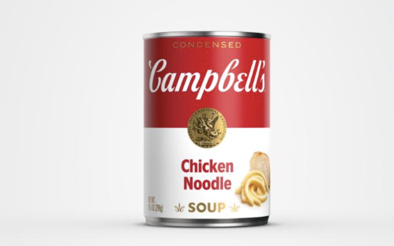
New look, same soup.
Product design is engineered to be memorable. If people can’t pick out a certain brand at a supermarket, there’s not much hope they’ll buy it.
When a company sticks with a particular design for decades, something about that item feels trustworthy. It’s familiar and reliable and has stood the test of time, instead of fading to the clearance rack.
It goes without saying Campbell’s soup is one such iconic design. Andy Warhol’s rendition immortalized the humble label. Holiday commercials with a smiling, melting snowman generate warm memories, too. So it’s no wonder the 152-year-old company remains steadfast in grocery aisles and pantry shelves.
But 50 years after Campbell’s soup became a pop art icon, its label is getting an upgrade.
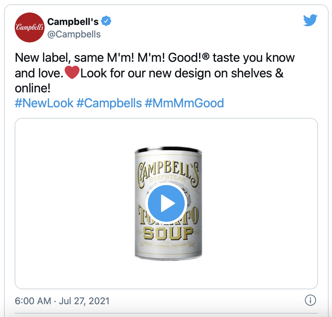
On July 27, Campbell’s unveiled the new design on Twitter with a graphic honoring every iteration of the can’s label. The newest adjustments are minimal — Campbell’s implemented a “modernized logo scripture,” or in basic terms, a font change.
“The refreshed label still evokes the same sense of comfort, goodness, and Americana,” Campbell’s said in a statement. Last year, thanks to the pandemic, Campbell’s (and other soups) sales went way up as more people cooked from home and fully stocked their pantries. The label’s refresh reflects the soup itself, which helped make easy meals to feed homebound bellies.
“We’ve been on a journey to reimagine this iconic brand and appeal to new generations of consumers who are cooking at home more than ever, while still honoring our rich history,” says Linda Lee, Campbell’s chief marketing officer for meals and beverages, in a statement.


In Other NEWS