


By Tim Nelson | FoodAndWine.Com
Troy Warren for CNT #Foodie

It’s all about graphic design and quality control.
Maybe you haven’t looked too closely lately, but there’s a lot of information to be found on the average snack wrapper or bag of chips. Obviously there’s the nutrition facts (which mostly exist to make you feel guilty) and info about serving sizes (which are not based on any human’s appetite). These days, you’re also likely to find some kind of feel-good story about the brand and its history, in an effort to convince you that you’re enjoying a wholesome treat made with love and care just for you.
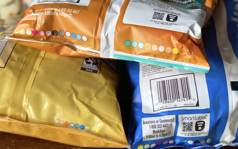
Look beneath all that, south of the copyright information and the bar code, and you might find a colorful mystery. What does this rainbow of circles mean? Will deciphering this series of snacking runes somehow grant you access to a lifetime supply of treats?
To be frank, the answer to that last question is a resounding no. But these aesthetically pleasing circles do serve a purpose — one that just happens to have more to do with packaging and graphic design than nutrition, freshness, or taste.
What Are Those Colorful Circles on My Food Packages?
As it turns out, there’s a name (well, two names) for those colored circles. Depending on who you ask, they’re either “process control patches” or “printer’s color blocks.”
No matter what one calls them, they ultimately serve the same purpose: making sure that the colors used to print packaging are up to par by testing how a certain set of “process colors” are coming out. Basically, they’re a design checklist to scan before shipping said product out the door.
Often, that means you’ll see circles of black, magenta, cyan, and yellow, which can combine to form a wide variety of hues. If you have a color printer at home, you’re probably already familiar with the power of these particular printing shades.
Those aren’t the only colors you’ll see, however. Some boxes and bags exist predominantly as a special color (or colors) that’s become a big component of the branding. In those cases you’ll often see circles of a non-primary color that matches that tone. It makes sense: if your professional printing reputation hinges on your ability to faithfully reproduce the particular shade of orange that dominates a Cheetos bag, you’re probably going to want to make sure you really nail it.
Though these circles may just look like splotches of color to the untrained eye, each apparently contains a wealth of information that those in the know can use to assess printing performance. As an old General Mills blog post quoted by Slatesays, they’re “essentially a tool used to understand how a printer is printing at any moment in time to ensure consistency.” They do that by conveying “very technical information about printing conditions that allow printers to quickly adjust.”
In essence, if a color is coming out a bit too wonky to match how it’s supposed to appear on the bag or box, printers can spot the issue and change course on the fly, by either adding more of a given color or taking it away. Sometimes machines can “read” these colors and determine if the course needs to be corrected, especially in more modern printing practices.
However, human printers are perfectly capable of handling on their own, and Dillon Mooney, a technical consultant for Printing Industries of America, told Slate that an “operator typically makes the final adjustments.”
What If There Are No Circles?
While some packages include circles with colors that are central to the brand, some packaging doesn’t include colored circles at all. Why? It’s really just a matter of personal preference. Since these color codes have nothing to do with the actual health and safety of a food product, there’s no requirement that they show up. With an understanding of the role those circles play, you almost have to admire the confidence of the printer/packaging who feels they can get by without it.
So there you have it: more than you ever really needed to know about the mysterious, colorful circles on the bottom of food packaging. As it turns out, they have more to do with graphic design than snacking, and therefore shouldn’t indicate anything about the quality of what you’re eating in any way whatsoever. Still, you can bet that staring at these is more fun than reading the nutrition facts.


In Other NEWS